Copula III — Applications
In this post, we may quickly go through the applications for Copulas. Firstly, let’s talk about quantile regression based on Copula, and then move to a real-world case about anomalies detection.
1, Quantile Regression
Synthetic Data
Unfortunately, I do not find a good way to synthetic data in Python, but R does provide some great functions for Copulas. I’ll use R to generate artificial data, and use Python to do the quantile regression. (However, I highly recommend to use R to do everything because R is more sophisticated, and Python module about Copula is buggy.)
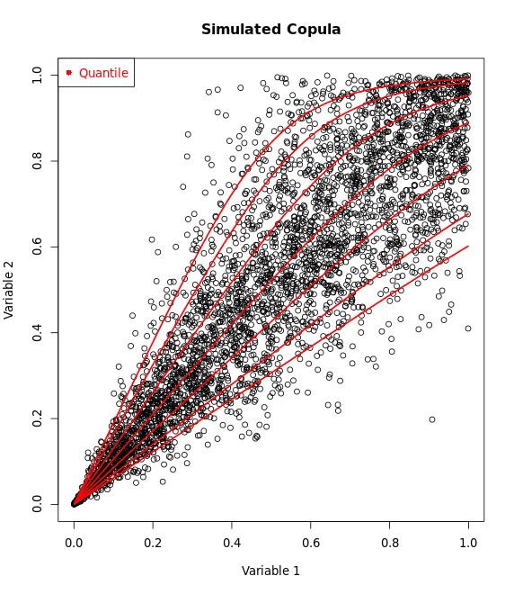
Suppose $X \sim \text{Norm(100, 4)}$, $Y \sim \text{Exponential(5)}$ with rotated Clayton Copula, then use R to generate and save results.
library(copula)
library(MASS)

thetaClayton<-6
copulaClayton_sim<-claytonCopula(param=thetaClayton,dim=2)

simData<- -rCopula(500,copulaClayton_sim)+1 #rotate the data for deeper understanding
plot(simData)

X<-qexp(simData[,1],rate=0.2)
Y<-qnorm(simData[,2],mean = 100, sd = 4)
data = cbind(X,Y)
write.csv(data, file = "synthetic_data.csv", row.names = FALSE)
In Python, check data distribution
import pandas as pd
import numpy as np
import matplotlib.pyplot as plt

data = pd.read_csv('synthetic_data.csv')
X = data['X']
Y = data['Y']

rate = 0.2

# Data for the normal distribution
mu = 100
sigma = 4

fig, axs = plt.subplots(1, 2, figsize=(6, 3))

axs[0].hist(X, bins=30, density=True, alpha=0.6, color='b')
xmin, xmax = axs[0].get_xlim()
x = np.linspace(xmin, xmax, 100)
p = rate * np.exp(-rate * x)
axs[0].plot(x, p, 'k', linewidth=2)
axs[0].set_title(f"X, rate = {rate:.2f}")
axs[0].set_xlabel('Value')
axs[0].set_ylabel('Density')


axs[1].hist(Y, bins=30, density=True, alpha=0.6, color='g')
xmin, xmax = axs[1].get_xlim()
x = np.linspace(xmin, xmax, 100)
p = 1/(sigma * np.sqrt(2 * np.pi)) * np.exp(-(x - mu)**2 / (2 * sigma**2))
axs[1].plot(x, p, 'k', linewidth=2)
axs[1].set_title(f"Y, mu = {mu:.2f}, std = {sigma:.2f}")
axs[1].set_xlabel('Value')
axs[1].set_ylabel('Density')

plt.tight_layout()
plt.show()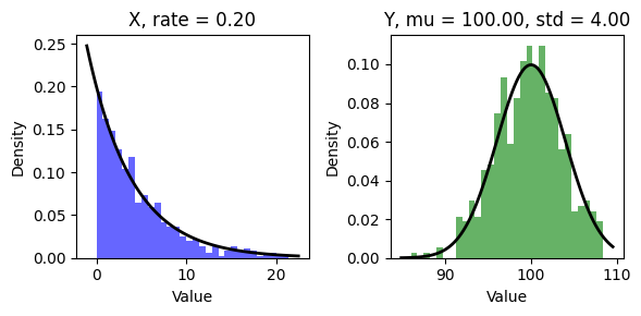
Determine Copula
Since we generated data from Clayton Copula, so we already know we should use Clayton copula. However, let’s imagine we do not know the process of generating data, which means we do not know which Copula type we should use, and we need to determine the Copula (for now, just consider Gaussian, Clayton and Frank).
Actually, we should also hypnotize that we do not know the information about the distribution for each variable, and we should use statistical method to estimate the parameter. For convenience, we just use the exact parameters.
The key is to plot the CDFs.
from scipy.stats import expon, norm

# Calculate the CDF for the given values
U = expon.cdf(X, scale=5)
V = norm.cdf(Y, loc=mu, scale=sigma)

plt.scatter(U,V)
plt.xlabel('U')
plt.ylabel('V')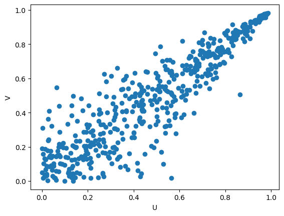
By the CDF plot, it’s easy to determine the copula type, isn’t it? Yes, Clayton! Here, we just have a rotated Clayton pattern.
We can rotate the data by -U + 1 and -V + 1
empCopula = np.column_stack((U, V))
empCopula_rotated = -empCopula + 1
Fit Clayton Copula
If you haven’t installed copulas in python, use pip install copulas to install.
from copulas.bivariate import Bivariate, CopulaTypes

clayton = Bivariate(copula_type=CopulaTypes.CLAYTON) #specify clayton copula
clayton.fit(empCopula_rotated)
Create quantile regression line
Usually, we are interested in 5%(lower), 50%(median) and 95%(upper) quantiles.
theta = clayton.theta

alpha=.05
quantileLow= ((alpha**(-theta/(1+theta))-1) * empCopula_rotated[:,0]**(-theta) + 1)**(-1/theta)

alpha=.5
quantileMid= ((alpha**(-theta/(1+theta))-1) * empCopula_rotated[:,0]**(-theta) + 1)**(-1/theta)

alpha=.95
quantileHigh= ((alpha**(-theta/(1+theta))-1) * empCopula_rotated[:,0]**(-theta) + 1)**(-1/theta)plt.scatter(empCopula_rotated[:,0], empCopula_rotated[:,1], label='Empirical Copula')
plt.scatter(empCopula_rotated[:,0], quantileLow, color="orange", label='Quantile Low', s=10)
plt.scatter(empCopula_rotated[:,0], quantileMid, color="orange", label='Quantile Low', s=10)
plt.scatter(empCopula_rotated[:,0], quantileHigh, color="orange", label='Quantile Low', s=10)
plt.legend()
plt.show()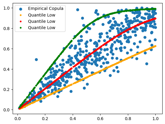
Transform results to original data
The result above looks great, but we cannot understand this for original X and Y, so we need one more step to let regression line fit the original data.
quantilesLowMidHigh = pd.DataFrame({
    'Low': quantileLow,
    'Mid': quantileMid,
    'High': quantileHigh
})

mean = 100
sd = 4

# Define the function to be applied
def transform_quantiles(z):
    return norm.ppf(-z + 1, loc=mean, scale=sd)

# Apply the function to each column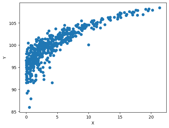
reconstrQuantiles = quantilesLowMidHigh.apply(lambda z: transform_quantiles(z), axis=0)plt.figure(figsize=(10, 6))
plt.scatter(X, Y, label='Original Data')
# Add reconstructed quantiles points
plt.scatter(X, reconstrQuantiles['Low'], color='orange', label='Low Quantile', marker='o')
plt.scatter(X, reconstrQuantiles['Mid'], color='red', label='Mid Quantile', marker='o')
plt.scatter(X, reconstrQuantiles['High'], color='green', label='High Quantile', marker='o')
plt.xlabel('Predictor')
plt.ylabel('Output')
plt.legend()
plt.show()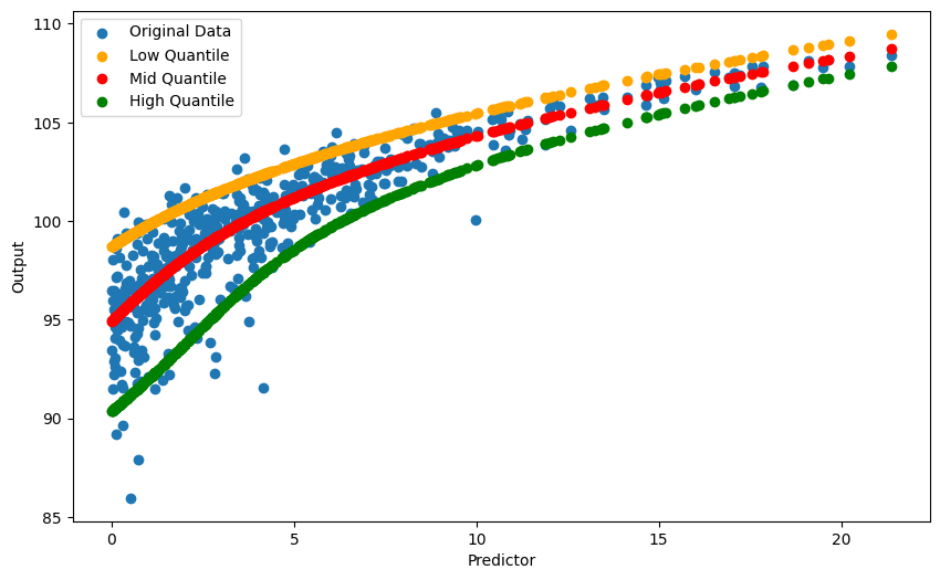
2, Anomalies Detection
Now let’s dive into a real-world data. In Miami, FL, our experience tells us higher air temperature leads to more precipitable water since more water evaporates. NOAA Physical Sciences Laboratory (PSL) provides monthly air temperate (air.mon.mean.nc) and precipitable water (pr_wtr.eatm.mon.mean.nc) data, and we can download data from their website. Until now, the data is from 1979 to 2024.
Read the data
import netCDF4 as nc
import numpy as np
import matplotlib.pyplot as plt

# Load netCDF file (Temperature)
temp_ds = nc.Dataset('air.mon.mean.nc', mode='r')

# Load netCDF file (Precipitable water)
water_ds = nc.Dataset('pr_wtr.eatm.mon.mean.nc', mode='r')

# Coordinates for Miami, FL
lon = 279.8082  # Converted longitude for Miami
lat = 25.7617   # Latitude for Miami

# Finding the nearest longitude and latitude indices
def find_nearest(array, value):
    array = np.asarray(array)
    idx = (np.abs(array - value)).argmin()
    return idx, array[idx]

idxLon, _ = find_nearest(temp_ds.variables['lon'][:], lon)
idxLat, _ = find_nearest(temp_ds.variables['lat'][:], lat)

# Normalize temperature data
def normalize_data(data, dates):
    monthly_means = [np.mean(data[dates == month]) for month in range(1, 13)]
    monthly_sds = [np.std(data[dates == month]) for month in range(1, 13)]
    mu = np.array(monthly_means)[dates - 1]
    sd = np.array(monthly_sds)[dates - 1]
    return (data - mu) / sd

# Temperature data for location
temper_dates = np.concatenate((np.tile(np.arange(1, 13), 45), np.arange(1, 2)))  # months

temper_loc = temp_ds.variables['air'][:,0, idxLat, idxLon]
temper_loc_norm = normalize_data(temper_loc, temper_dates)

# Precipitable water data for location
water_loc = water_ds.variables['pr_wtr'][:, idxLat, idxLon]
water_loc_norm = normalize_data(water_loc, temper_dates)
n_points = len(temper_loc_norm) # or 541 if you are working with fixed length
# Create a figure and a set of subplots
fig, axs = plt.subplots(2, 1, figsize=(6, 8))
# Plot normalized temperature data in the first subplot
axs[0].scatter(range(n_points), temper_loc_norm, edgecolors='black', facecolors='none', label='Temperature')
axs[0].set_title('Normalized Temperature Data for Miami, FL')
axs[0].legend()
# Plot normalized precipitable water data in the second subplot
axs[1].scatter(range(n_points), water_loc_norm, edgecolors='black', facecolors='none', label='Precipitable Water')
axs[1].set_title('Normalized Precipitable Water Data for Miami, FL')
axs[1].legend()
# Adjust layout to prevent overlapping
plt.tight_layout()
# Show the plot
plt.show()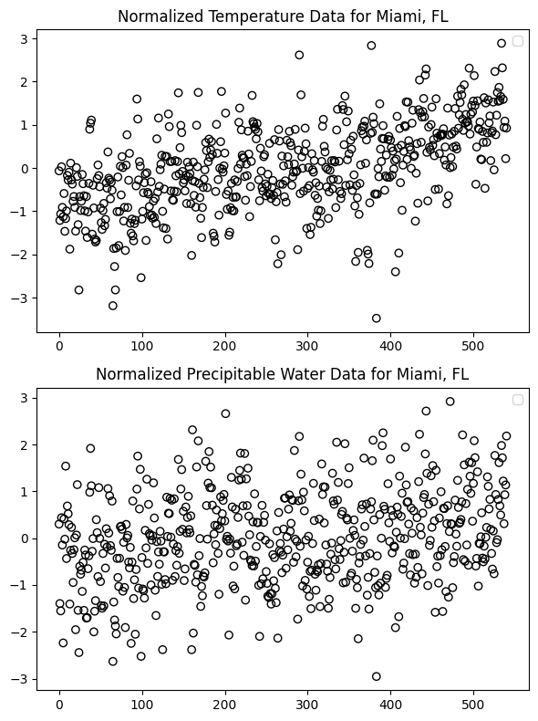
check for bivariable relationship:
plt.figure(figsize=(8, 5))
plt.scatter(temper_loc_norm, water_loc_norm, edgecolors='black', facecolors='none')
plt.xlabel('temper_loc_norm')
plt.ylabel('water_loc_norm')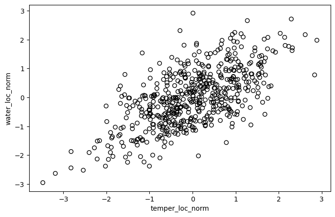
Determine Copula by ploting empirical Copula
check the distribution for each variable:
fig, axs = plt.subplots(1, 2, figsize=(10, 4))

axs[0].hist(temper_loc_norm, bins = 20)
axs[0].set_title('Normalized Temperature')
axs[0].set_ylabel('frequency')

axs[1].hist(water_loc_norm, bins = 20)
axs[1].set_title('Normalized Precipitable Water')
axs[1].set_ylabel('frequency')

plt.tight_layout()
plt.show()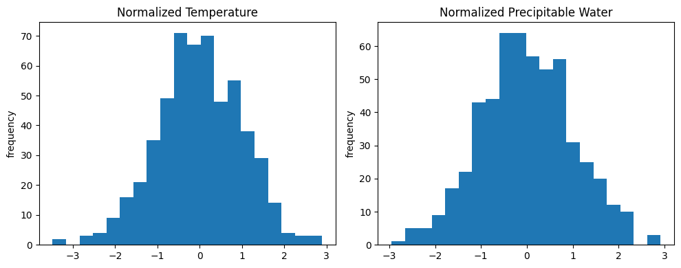
For convenience, we naively treat air temperature and precipitable water as normal distribution with $\mu = 0$ and $\sigma = 1$ (since we normalized data before).
from scipy.stats import expon, norm

mu = 0
sigma = 1
U = norm.cdf(temper_loc_norm, loc=mu, scale=sigma)
V = norm.cdf(water_loc_norm, loc=mu, scale=sigma)

plt.figure(figsize=(8, 5))
plt.scatter(U, V, edgecolors='black', facecolors='none')
plt.xlabel('temperature')
plt.ylabel('water')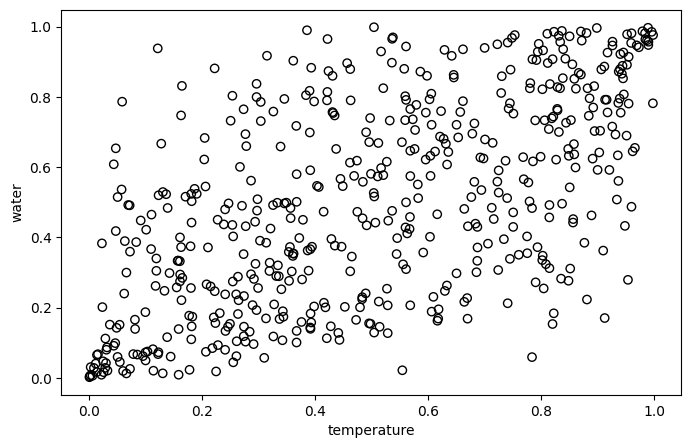
Now, as a Copula expert, which copula would you recommend (from Gaussian, Frank and Clayton)?
Yes, Frank!
Fit Copula and quantile regression
import numpy as np
from scipy.stats import expon, norm
from copulas.bivariate import Bivariate, CopulaTypes

empCopula = np.column_stack((U, V))

frank = Bivariate(copula_type=CopulaTypes.FRANK)
frank.fit(empCopula)
from scipy.stats import rankdata
theta = frank.theta
nTime = len(temper_dates)
tempRanks = rankdata(temper_loc_norm) / nTime
def calculate_bound(ranks, alpha, theta):
return -np.log(1 - alpha * (1 - np.exp(-theta)) / (np.exp(-theta * ranks) + alpha * (1 - np.exp(-theta * ranks)))) / theta
# Calculating bounds for different alpha values
alpha_low, alpha_high, alpha_mid = 0.05, 0.95, 0.5
lowBoundWater = calculate_bound(tempRanks, alpha_low, theta)
highBoundWater = calculate_bound(tempRanks, alpha_high, theta)
midBoundWater = calculate_bound(tempRanks, alpha_mid, theta)tempRanks = rankdata(temper_loc_norm) / nTime
waterRanks = rankdata(water_loc_norm) / nTime
# Identify anomalous indices based on your conditions
anomLowWaterIdx = (waterRanks < lowBoundWater) & (tempRanks > 0.5)
anomHighWaterIdx = (waterRanks > highBoundWater) & (tempRanks < 0.5)
# Plot
plt.figure(figsize=(10, 6))
plt.scatter(tempRanks, waterRanks, alpha=0.6) # Base data
plt.scatter(tempRanks, lowBoundWater, color="orange", s=10) # Low bound
plt.scatter(tempRanks, highBoundWater, color="orange", s=10) # High bound
plt.scatter(tempRanks, midBoundWater, color="green", marker='*', s=50) # Mid bound
plt.scatter(tempRanks[anomLowWaterIdx], waterRanks[anomLowWaterIdx], color="red", label='Anomalous') # Anomalous low
plt.scatter(tempRanks[anomHighWaterIdx], waterRanks[anomHighWaterIdx], color="red") # Anomalous high
plt.xlabel('Temperature')
plt.ylabel('Water Rank')
plt.title('Temperature vs. Water Content')
plt.legend()
plt.show()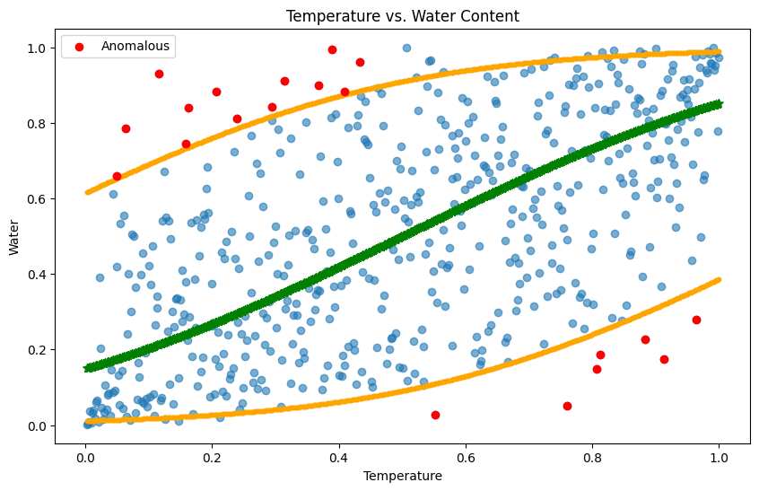
This result is great because quantile regression can reveal the interdependency between two variables rather than simply treating them independent. Therefore, different from naïve linear model or manually set a quantile range to detect anomalies, Copula is able to give us a reasonable sensitivity to anomalies, not too high or too low.
Summary
Wow, we finished Copula in three lessons 😇. Copula, amazing.
I studied Copulas last quarter in the Linear & Nonlinear class, and in the final week, we asked our professor which topic was his favorite in this class. He said that everyone and every topic is like his child, but if he had to pick one favorite topic, it would be Copulas. That evening, we ventured into a cozy bar, our hands cradling cups brimming with delicious drinks, as we gathered in a welcoming space, exchanging tales. It was a night of splendid camaraderie and a tribute to our remarkable professor.
Copulas have a wide range of applications across numerous fields. Beyond their use in anomaly detection within environmental studies, they are also pivotal in finance, insurance, and more. In essence, if the goal is to analyze multivariate nonlinear relationships, Copulas often emerge as the go-to methodology.
Thank you, and see you next time.